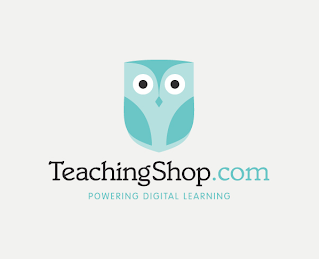
This was a project which I found on BEHANCE, where David Robinson had to design the logo, identity, website, and stationary for a new e-learning resource.
His inspiration was clever, using the identify of the OWL for being wise, the book to for learning and the crest for the school. He combed all these into the logo of an own with the shapes and designs of the above items incorporated in it.
It is simplistic, inviting and not too daunting - bearing in mind it is for school children looking for ways of learning. I think that it is a clever design, through the use of a image as the logo for the new resource rather than an icon or type - it is more friendly.


No comments:
Post a Comment