"1000 PACKAGE DESIGNS" - Rockport
Some of the designs I have chosen are for inspiration of how I should design my packaging, and others are more to do with the different styles of packaging.
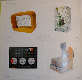
- Looking at different materials and die cuts of the packages
- A package for the leaflets maybe...something to keep them on display.
- Although this image is not very clear - here I was focusing on looking a the transparent acetate which makes the product visible and the weight of the stock.
- This piece of packaging is not particularly relevant to what I am going to place my product in, but thinking further about the project - creating and printing on plastic bag to carry the product around in once purchased.
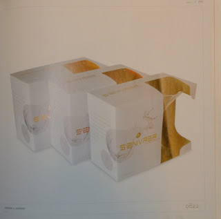
- Simpel and elegant box for packaging. Having the face of the box with just the brand name on it, and the decoration round the sides - effective design - elegant.
- Here I was looking at the interior packaging for the product and how I could keep it in place and also on display.
- This image made me think more about after the product has come out of the packaging, it may be a good idea to create some sort of print based design which could keep the product on display while not being used.
- Looking at the more promotional side of the project - die cutting and using different formats and stocks to print onto as well as print finishes such as embossing.
- Circular format of packaging - I don't think that I will be intersted in using this but still good to have as an idea.
- Designing packaging in a set / series - aimed at different audience - shape and make the packaging more appealing to your target audience - it will also make the product stand out more as it then becomes more personal.
- Examples of simple packaging with direct, obvious but yet effective messages on them such as 'eat me'...small bit of humour in it.
- Looking at different materials and working the packaging around the product being completely visible and how to design around that.
- Simple stock and open boxes
- Packaging for the promotion - how to make the promotional side of the product more appealing, stand out and be innovative.
- An idea of opening the packaging in a different way than from simply lifting the lid, gets the customer to interact with it more.
- Examples of mobile phone packaging designs - simple boxes, and simple clear designs, not using many colours
- If you look closely at the left image of the phone package - it has been intricately die-cut, creating a mesh affect and very visually pleasing and more attractive, it is something different.
- Another image where a simple box format is used but one end of it has been cut and designed around the shape of the product so that it is on display.


No comments:
Post a Comment