BRANDING & IDENTITY
PACKAGING & PROMOTION
PUBLISHING & EDITORIAL
INFORMATION & WAYFINDING
CMYK (process)
Subtractive.
This is used in the most common printed process called litho or offset litho
SPOT COLOUR
Spot colour (one or more specially mixed colours as opposed as a result of a CMYK or RGB mix)
MONOCHROME & TINTS (solid colour & half tone)
Mono (like greyscale but with a coloured ink, ie: one colour and percentage tints of that colour, plus the colour of the material it’s printed on)
1) CMYK
BRANDING & IDENTITY
This was a job where for a Lighting Company in Sydney. The brief described the designer to create a brand to be 'funky yet professional'. The designer used warm and vibrant colours for the light beams and spot circles to create 'energy'. I was drawn to this business card because of the simplistic yet creative use of colours.
PACKAGING & PROMOTION
This was a project for a competition to design a brand new style of paints.
I chose this project because of the simplistic designs yet broad use of different pantone colours of CMYK. The design of the projects is simple yet modern. The mix of colours give the 'arty' feel to the product.
BRANDING & IDENTITY
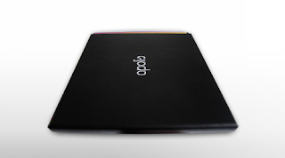
Apolis is a well known restaurant on the hill above Athens, offering premium quality dishes to national identities. The style of the logo represents the timeless elegance and unleashes the power of black
This project caught my attention because of the simplistic and very chic design of the brand. Using black as the key colour and basis of the background it allowed the colours (CMY) to be highlighted. The letterform of the logo is innovative and modern, and when the logo is placed on the clear glass bottle it looks incredibly smart.
2) SPOT COLOUR
PUBLISHING & EDITORIAL
This was an annual book to which was about the struggle against the Apartheid created by the Norwegian Council for Africa. This book has been going since 1967 and this year they wanted to take the book in a more art direction and editorial design. The illustration of the front reflects the great power nations interest in Africa.
The use of the spot colour of pastel green makes the book more visually engaging and smart. I like the use of white and green, it gives a peaceful feel to the book, representing the contents of the book. The pictures are mono-chrome/grey-scale creating a contrast between the vivid colour of the green. This also makes the important information stand out.
BRANDING & IDENTITY
This is an innovative deign for a business card using 2 spot colours. It has a UV spot colour varinish to tie together the design with the designers website portfolio designs.
3) MONOCHROME & TINTS
INFORMATION & WAY FINDING
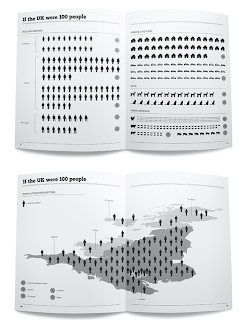
This piece of work is a collection of info graphics designed to present British statistics collected from a series of sources (including the Office for National Statistics and OnePoll). They was converted and designed into info graphics to help with the visualisation of the data, it provided a clearer understanding of information and more attractive for someone to read.
In this case, the monochrome colour scale was taken on to create a link between both traditional and contemporary icons but also as a reference to 20th Century British News paper.
I chose this project as I feel it is visually engadging without being too overly complicated. I find info graphics visually intersting and much prefer reading them to a page of statistics, it is easier to remember and more engadging. I would be intersted to see what effect it would have on the piece by adding colour. It might be over complicating and taking away the representation of the British news paper, but I feel that the use of the monocrome can make it look quite simplistic and boarderlying dull.
BRANDING & IDENTITY
This is a logo and brand created for Ricky-Joe Burrage, a photographer which an incredibly impressive list of credentials, having taking photographs of the likes of Kate Moss, Naomi Campbell and Gordon Brown. A very simplistic logo was created using the lower case of his initials 'R & L' to create the 'perfect frame' of an image. This monochrome brand caught my eye because of the pure simplicity, not complicated and not over crowded. In this case I feel that the monochrome accentuates the style and simplicity of the business cards and branding.
MONOCHROME & TINTS EXAMPLE
PUBLISHING & EDITORIAL
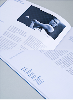
This is a report publishing the Scottish athletic results for 2006-6. It was created in a visual style to give it a reference to the running tracks of graphics.
I like the report because of the monochrome making it more visually interesting than both a grey-scale or a full coloured report, it is simplistic and makes it easier to read as well as making the report look smarter.


No comments:
Post a Comment