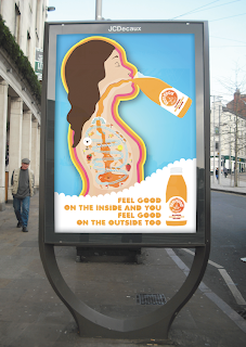
Most of the posters are pretty simple, using white space to attract the eye of the audience, while other posters have used the opposite method and used an abundance of colour and bold / basic shapes
These two adverts are examples of what I was talking about above, using lots of bold bright colours that will contrasts to the surrounding environment to catch the eye of the audience. Although I think that they are successful in doing this, I feel there needs to be more facts about the product on the advert rather than just showing images of the inside of people and representing their healthiness and goodness that way, a simple line saying '100% natural ingredients' or 'absolutely no sugar' would keep the attention of people, otherwise people may just walk by thinking that it is just another sugar filled fruit juice.
Simple, silly but amusing and rememberable
I really like this piece of design. I don't think that it was use officially as an advert for the product however I do like the simple choice of colours and the use of white space to try and attract the target audience's eye. The poster has a sophisticated yet friendly appearance - However I don't feel that the typefaces that has been chosen for the main heading works, I think that it needs to be more in-keeping with the main typefaces used for the brand.
Simple but easily identifiable with the brand. The one issue with this poster is there is no image of the product on so people would not necessarily automatically make the connection if they saw the product on the shelf in a supermarket.
Im not really a fan of this poster, it is too complicated and distracts from the product as well as the fact that you can hardly make out what the text says. I know the the lines are meant to represent the measurments of emotions and experiences when you drink this, but I don't believe this has come across very effectively and instead just blocks out the image of the drink.
I think these are the official adverts. By placing an images of a cartoon character at the bottom it does give the drinks more character, however I don't really see the relevance and can be slightly distracting from the rest of the poster; I feel that placing information here would be more effective. I do like the colours that have been used in the blue poster, they compliment the colour of the drink well.


No comments:
Post a Comment