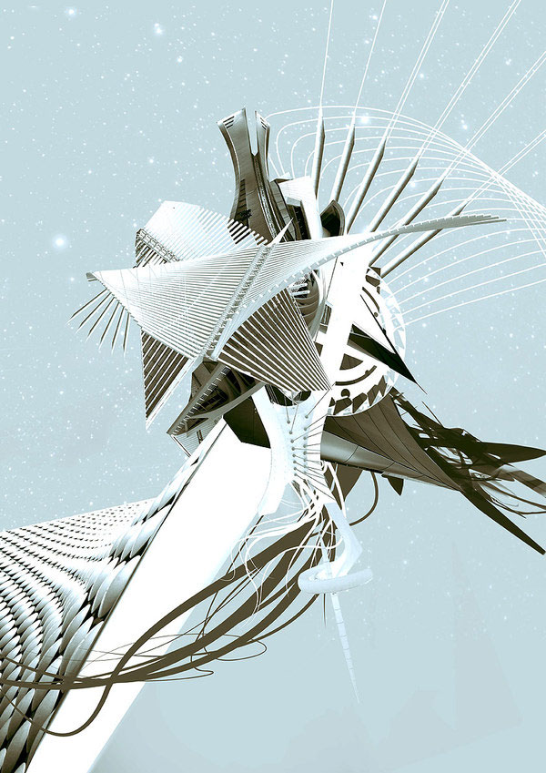
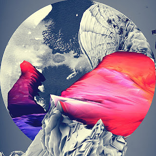
This is a collection of geometric based pieces of design. I was drawn to them because of their elaborate and extensive creativity. They are a combination of different elements e.g. geometrics, illustration, photography and design. They are intended to an audience to take an interest in these subject areas and are created for an aesthetic purpose and design to be seen in a portfolio, exhibition, internet, magazine.
LIGHT BEYOND SOUND
I found this collection of work on BEHANCE. I was instantly drawn to its delicacy, detail, accuracy, and the other world/dimension that it seems to be showing. Its purpose is in the title 'light beyond sound', these images were put to music in a video. There are a work of art and have a fine art quality and once again I feel they are more for the aesthetic purpose and aimed at people who appreciate fine art, graphics and photography combined. I feel that this is a hugely successful project in relation to its title, they are incredibly detailed and very very interesting.
This collection is created as an artwork. All of the works above I have taken a great interest in because of their colour, shapes, graphics and underlying photography elements. The power of the picture is through all of these methods without adding type. They would be seen in a gallery, no clear purpose other than to be observed in detail.
ILLUSTRATION
I am not normally hugely drawn to illustration collection and pieces but this series of images I was drawn to the bold style of it, its not too fine and complicated, just simple heavy lined drawings. They are advertisements for MC WEAR so would be see on the street, on the internet and in magazines and is aimed at the younger generation shown by the characters who are clearly in their 20's. They are good pieces of illustration however I was unclear as to what they were about until I saw the last image, so not hugely successful in my eyes.
SYMBOLS
Logo and image based poster for amusement purposed. Aimed at anyone between their teens and late 20s' - simple design.
Aesthetic purpose - I chose to upload this because it is similar to the first two project that I analysed on this page, it concentrates on shapes, colours, and the bizarre and complicated arrangement of it all to produce and 'organised chaos' in a way. Aimed at people who find this type of image intersting
I chose this piece because in a strange way it reminds me of Japanese prints with brighter colours and no black outlines. It has more of an illustration quality and no real purpose other than to be enjoyed in a gallery.
Geometric poster to be seen in an exhibition, aimed at the same audience as above. I was drawn to it because of the abstract arrangements of shapes and the very basic but effective colour schemes.

This image reminds me of advertisements for club nights out and flyers which students are given. It could also be used for a music artwork design. I love the combination and arrangement of the replicated photograph. I feel that this image is aimed at the younger generation, music lover and club goers - also shown through the bright/electric choice of colour shapes. It is a successful image because you straight away think of nightlife and music through the image of the woman and the colour scheme.
Fine art/screen print/japanese print-like quality, aimed more at art collectors and people with a sophisticated taste with an interests in abstract illustration. The most recent issue of Creative Review was dedicated to illustration, many of the pieces in the magazine were similar to this.
This is a version of the Nike Logo so would be use in its marketing and promotion campaigns in magazines, TV, internet, billboards. The function of this is to identify the logo with the company, even though it is not the original logo and it has been edited, it is still recognisable and universally known as Nike. It is for a global audience of sportsmen and sports companies worldwide. It is one of the most famous logos in the world so it is a very successful image.


No comments:
Post a Comment