
"Graphic Design....is a solution to a problem of communication through design."
Before I started this Graphic Design course, a passion of mine while at school and in my spare time is expressive painting with vibrant colours. I have carried this interest on while on this course and when developing ideas for my work I start by researching work which uses the colour, energy and styles which initiates from such work.
Another side of art I am interested in poster/promotional design especially for the music and club industry as they too have a complex layout and use vibrant colours to catch the viewers attention.
In these images below, it is the colour and boldness of the layout and design communicate the clear message that they want to stand out which interests me.


This is a poster advertising a night out


"Graphic Design...is the effective delivery of a message, idea or concept through the use of visual language."

"Graphic Design...simple and effective."


Other pieces/designers which have caught my eye...


Michelle Haswell


London College of Art - work

Absolute Vodka Advert


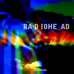
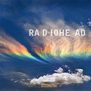
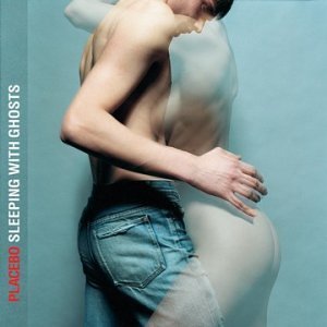
Music Album Artwork is another area of graphic design which I am passionately interested


.jpg)


BANTJES
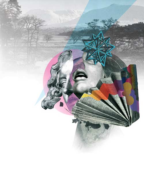
Looking through the November 2010 issue of Creative Review the work of Marian Bantjes, a Canadian Graphic Designer caught my eye because of my recent typeface brief. Bantjes is also an accomplished writer in design and typography.


JAMES DAWE
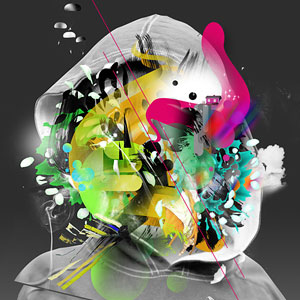
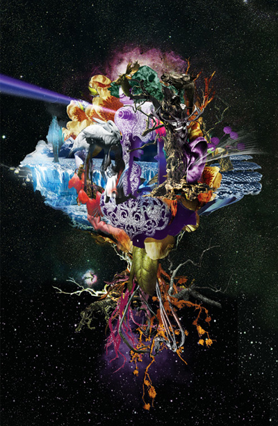
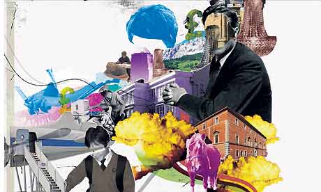
Dawe is a London based illustrator. His unusual work also caught my eye in Creative Review. It is a mix between illustrative pieces, photography and graphically edited work, combined. The brightness of the colours and the complicated compositions give a exiting and vibrant feeling to his work. This piece below especially caught my eye as you can look continually at the piece and still find something new, it reminds me a fantasy land.


BEHANCE WEBSITE
I found a number of pieces/project with intersted me on this website
WTF - by Minga
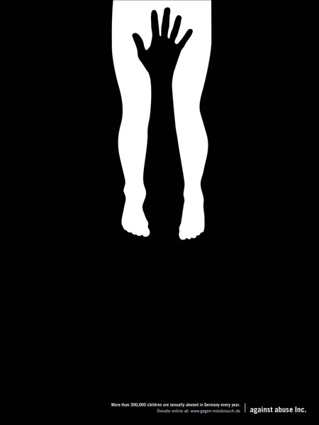
The pieces I have shown below interested me due to the simple but amusing designs. My recent project was to design posters which had to be simple, to the point and to get a clear message across to the intended audience using 2 colours and a stock. These posters only use a stock and 1 other colour and have been stripped down to it's simplest form possible and still are very effective.


COLOURLESS PACKAGING - HARC LEE
This project I was looking at eco-friendly packaging - trying to reduce air pollution and reducing energy when it comes to recycling (by not having paint on the products.) Instead of having paint sprayed on the products, a process which presses aluminium is used. I really liked this idea and the final product looks sleek, modern and aesthetically pleasing.


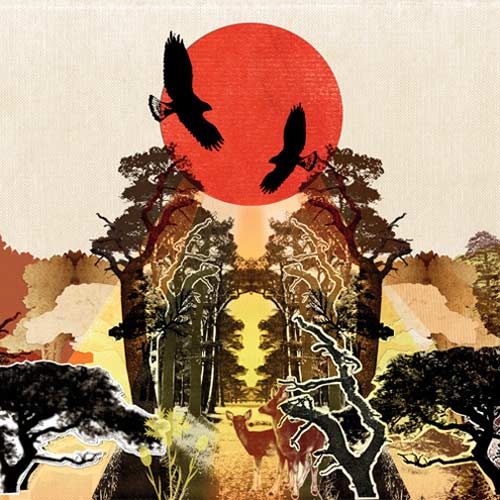
NIELLY FRANCOISE
I showed a piece of her work right at the start of this blog and have since found more of her work which I have shown below. I am drawn to her work through the bright expressive colours and despite her work being hand rendered - the use of the pallet knife creating straight edges and lines makes the pieces look like they have been edited. Her work is striking and bold.


S.O.T.O (STATE OF THE OBVIOUS) - Mash Creative
Having just done a brief on creating a mail shot - this project interested with with the different ways of presenting type onto an object. It is a simple message written on each of the products which state exactly what the product is for example 'This is my large black T-shirt'. This project interested me because I am looking at ways of stripping down the information to its simplest form.


Neue Hong Kong - Anthony Dart


HYPE ART BOOK - BRAM VANHAEREN
His work reminded me of the brief which we had to do over the summer - to create a typeface which portrayed/was relevant to me and my characteristics. I found it interesting the ways in which he has presented each letterform.


TYPOGRAPHY TREATMENT - STEFAN CHINOF
Still looking along the lines of typography and typfaces - I found this project which looks at the treatment of the typeface. Along with my interst in typography (and the earlier project I did on the course) I am interested in the treatment of it like in the images below.


KARIZMA - SILO
This work caught my eye as it is the type of graphic design I really like and want to develop my style of work around.


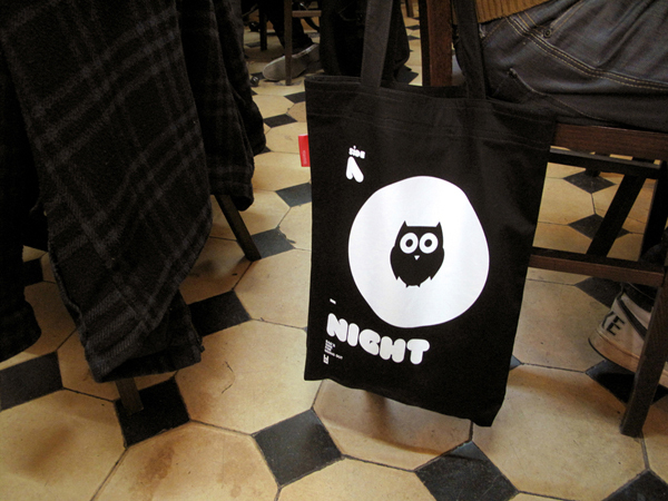
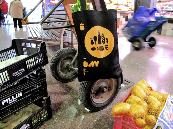
THE ANTI-PLASTIC BAGS - Toormix
Graphic design on products/bags - I like the simplicity of the design.


A DAY IN THE LIFE OF A GRAPHIC DESIGN STUDENT - Rishi Sodha
I found this project both visually inspiring and amusing because of the clean, simple techniques used to convey the message and entertaining because of its relevence!


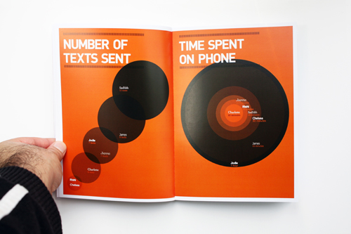


POSTER CAMPAIGN - WEAT IT WITH PRIDE
Here I was looking at different ways to present information on a poster


No comments:
Post a Comment