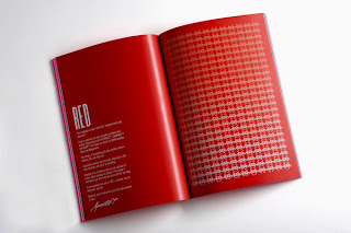
This is a good reference to laying out large words on a double page spread
Monday, 23 May 2011
Speaking From Experience - BEHANCE research
An example of a very nice magazine layout - i am looking at the different ways to arrange both text and headlines/single words over a double page spread without it looking dull
Speaking From Experience - BEHANCE research
Self promotional posters - looking at what they are saying in their simple statements and how they use a simple sans-serif typeface
The more I look at the project the more i love it - the layout, the simplicity and the comments. This page will be a very useful resource for future work. -
also a reference for WHAT IS GRAPHIC DESIGN
Using simple semi-circles and circles to align/highlight the text = very aesthetically pleasing
http://www.behance.net/gallery/FP7-Self-Promotion-Posters/932682
What is Graphic Design
I found this project while looking for Speaking From Experience research
It is a collection of logos and designed for a hotel - loved the simplicity but modern and exiting feel.
It is a collection of logos and designed for a hotel - loved the simplicity but modern and exiting feel.
Speaking From Experience - BEHANCE research
This is a very aesthetically pleasing project
The type is clear and similar to the typeface which I want to use but it is more spaced out and works better - use this as an example of how to lay out the pages
Subscribe to:
Comments (Atom)


