

Using text and image on the posters


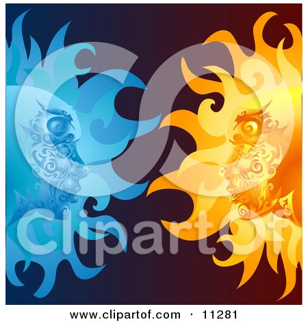
I love this piece - using the opposites of sun and moon in a very decorative style
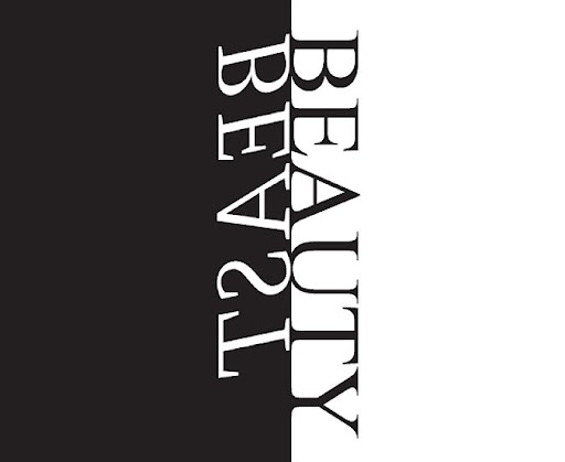
Simple - using the 2 opposites, black vs white and beaty vs beaste

Focusing more on the image but using type

The idea of using COMPLIMENTRY COLOURS as the focus of the typography

Health - waste (recyled vs non-recycled

This is an amazing piece - although there is not text, I love the mixture/contrasts of black and white

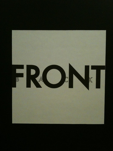
Literal thinking of opposite
No comments:
Post a Comment