Monday, 5 December 2011
Monday, 21 November 2011
Sunday, 20 November 2011
Top 10 Manual - Structure
CONTENTS
1.
COLOUR
MODES
a.
RGB – for screen,
reductive colour
b.
CMYK – for
print, additive colour
c.
CMYK gourmet
d.
Converting
to CMYK
2.
COLOUR
MODES
a.
Grey Scale
b.
Monochrome
c.
Duochrome
d.
Hexochrome
e.
Spot
Colour
f.
Halftone
3.
STOCK
a.
Gsm
b.
Coating /
Properties
c.
Availability
d.
Price
4.
PAPER
FORMAT
a.
ISO SIZES
b.
Box
c.
Poster
d.
Mailer
e.
Translucent
5.
PRINTER
a.
Rotogravure
b.
Flexogravure
c.
Lithogravure
d.
Digital
e.
Pad
f.
Screen
Printing
g.
Letterpress
6.
PRINTERS
a.
Talking to
a printer
b.
Price
c.
Finishing
availabilities.
d.
Preparing
for print
e.
Pre-flight
f.
Proofs
7.
FINISHES
a.
Emboss
b.
Deboss
c.
Matte
lamination
d.
Gloss
e.
UV spot
varnish
f.
All over
varnish
g.
Hand finish
h.
Die cut
i.
Foil blocking
8.
BINDING
& FOLDING
a.
Concertina
fold
b.
French fold
c.
Hand sewn
d.
Japanese buind
e.
Perfect binding
f.
Spiral bound
Top 10 Manual // Working with Printers
SELECTING A PRINTER
You should have an idea about the quality and volume of the design you want to print because different printers will have different limiations.
Look for a wide net of suppliers who can meet a top 3 criteria for buying print
You should get a quote for your project from 3 different printers and then decide which of the printers you want to chose from that. Make sure that your specifications that you gave each of the printers are the same.
Talk to the printers and see what options as far as finishes, binding and extras they have - some printers will not have the facilities e.g. die-cut and binding.
Find a printer than you can talk to - someone that can work efficiently on your deadlines and who can advise you on the best materials and processes for your job
NEGOTIATING PRICES
You need to get quotes from 3 different printers before you decide which one to go with
You then need to quote this back to your client before you start the job
It is perfectly acceptable and expected to engage in a little negotiation before you settle on a price. But remember to be realistic.
Top 10 Manual // Print Considerations
MAIN OBJECTIVES
If you are working with a new client, find out as much as you can about their business and what they want to achieve with the design work they have commissioned.
Focus on the objectives of the project as early on as you possibly can, and if the client isn't thinking objectively then encourage them to.
CHOOSING & SPECIFYING PAPER
This is one of the most crucial decisions you can make. You should decide this as early on in the design process as possible, before you start designing the work.
Different paper and board stocks with vary in price by a large margin depending on their finish and quality.
Availability of stock is another area to consider, paper stocks need to be pre ordered from the manufacturer.
If the end design has to be sent to the client by mail, the client would also appreciate if if the weight of the design is kept to a minimum.
The choice of stock isn't just based on the price and availability, you should consider the durability and tactile qualities of paper stock will greatly influence the value and tone of the product.
You should build up a collection of swatch books which can often be given free by the manufacturer - this will improve your knowledge and make your choice easier and faster.
PAPER PROPERTIES
A bad choice of paper choice is an expensive mistake - TALK TO THE PRINTER before and listen to what they say. To a certain extent the choice of paper will point you in the right direction for your design.
EG; paper for use on offset lithography machines should ideally have a low moisture content to help with the drying process.
Gravure is best matched to paper stock with a very smooth surface with no small abrasions, so for a gloss or matte coated stock.
Design For Print Top 10 Tips - Rework
I have previously produced a manual of my top 10 tips that you should consider when you are designing for print. I am now going to look back and I want to re-design and improve this manual and provide more information after completing my work for the Print Module.
AREAS TO CONSIDER
FORMATS
- Box
- Double hinge
- Fold out poster
- large-format poster
- gatefold CD
- inset pages
- Inserts
- mailers
- panoramic book
- pop-ups
- translucent
- ISO sizes
FOLDING / BINDING
- concertina fold
- french fold
- roll-fold
- perforated fold
- burstbound
- trimmed flush
- cotton binding
- gilded edge
- half canadian binding
- japanese binding
- hand sewn
- saddle stictching
- singer sewn
- perfect binding
- sprial bound
STANDARD PRINTING
- Digital
- Flexography
- Lithography
- Letterpress
- Monoprint
- Offset
- Silkscreen
- Screen printing
- single spot colour
- vegetable based inks
- water-based inks
- Rotogravure
- Pad Printing
FINISHING
- Die-cut
- Hand finishing
- foil blocking
- embossing
- matte lamination
- allover spot UV
- debossing
- varnish
- spot varnish
PLANNING CONSIDERATIONS
- What are the main objectives of the Project
- Talk to the client and get to know exactly what they want
- Paper properties - chosing and specifying the paper - most important decision
WORKING WITH PRINTERS
- Chosing your printer
- Negotiating prices
- Preparing for print
- Proofs
- Special Finishes - talk to the printer and find out what they can do before you chose the printer.
PRINT / DESIGN AREAS TO CONSIDER
- RGB / CMYK
- spot colours
- monochrone
- duochrome
- hexachrome
- greyscale
- over printing
- halftone pattern
- seperations
- PMS - pantone matching system
- CYMK gaumet
- spot colour > CMYK conversions
- registration / linen testers
- ISO paper sizes
- Document setup
- File Formats & Fonts
- Print marks
- Mock ups and proofs
- Print marks
- Mock ups & proofs
- Format / Imposition
MATERIALS TO PRINT ON - making the medium the message.
- Paper base
- Plastic Based
- Transparent surfaces
- other
SPECIALITIES AND COATING
- foil stamping
- thermography
BINDING, FASTENERS, CLOSURES
- options
FINISHES
- emboss
- engrave
- letter press
- Deboss
CUT WORK
- die-cut
- perforations
- kiss cuts
Obviously here there are many areas to consider so I will need to carefully select the areas which I want to talk about and consider them in order and how important they are.
I want to start with talking about planning the printing e.g. talking to the printer, having an idea of what you want to get out of the design, paper considerations etc.
Monday, 14 November 2011
Thursday, 10 November 2011
GOOD IS // Vouchers
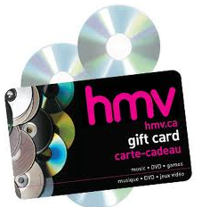
Another area of print which I am looking into is the vouchers. One of these comes in the packaging with the product but the aim with these is to be similar to itunes and HMV vouchers - good for gifts and can be purchasable in most major stores.
Ill be looking at business cards for the inspiration for stock, finishes and designs.
I want the cards to be simple, and easily identifiable.
BACK OF GIFT CARD
Ill be looking at business cards for the inspiration for stock, finishes and designs.
I want the cards to be simple, and easily identifiable.
BACK OF GIFT CARD
Subscribe to:
Comments (Atom)


