Tuesday, 25 October 2011

TASK 4 - SPECIALIST PRODUCTION & DEFINITIONS

TASK


Based on the terminology and examples introduced during this session, extend your awareness of the diversity of print production methods in relation to professional design practices discussed. See how many impacts on what you have learnt so far and how it might affect your personal interpretation of print issues around the 4 core areas below. 


BRANDING & IDENTITY
PACKAGING & PROMOTION
PUBLISHING & EDITORIAL
INFORMATION & WAYFINDING


It is important that you IDENTIFY and EVALUATE unfamiliar product, contexts and functions of design for print as this will help you to develop a broader and more informed understanding of the specialist nature of print production. 


MANDATORY REQUIREMENTS


A siereis of posts to your DC blog demonstrating an in depth investigation for print in relation to the 4 areas outlines 
Significant critical evaluation of the knowledge and examples identified through your research including informed reasons for their selection


LOOK AT:
How the Pantone Matching System (PMS) works.
What exciting alternatives different stock/substrates can provide in terms of options.
How you might collaborate/interact with specialists
How the same problem might be solved in different ways.

Monday, 17 October 2011

TOP 10 PRINT MANUAL

TOP 10 MANUAL // COLOUR MODES

Different areas to reserach further;
  • CMYK, RGB, PMS
  • Additative colour - too block out colours
  • RBG to CMYK conversions
  • Pantone Colours
  • Spot colours, monochrome, due-tone, tints
  • Separations


CMYK - CMYK or four colour process is created using the primary colours of pigment: Cyan (blue), Magenta (red), Yellow and Black. Black is designated the letter K to avoid confusion with B for blue. Because the inks used are translucent they can be overprinted and combined in a variety of different proportions to produce a wide range of colours.

RGB - If you are reading this, you are reading an RGB display via your computer. RGB stands for Red, Green and Blue. These are the three colours that create every other tone of colour that is visible on your screen. Whilst each monitor is capable of displaying a wide range of colours, there are still inconsistencies between computers. This is usually due to the fact that screens are not always accurately calibrated.

PMS - Spot colours, also known as PMS colours, and officially as Pantone Matching System colours are specific colour formulas that will reproduce accurately in print. Instead of simulating colours by combining primary colours (CMYK), spot (PMS) colours are pre-mixed with existing and published colour formulas


Sunday, 9 October 2011

TASK 3 - STOCK OPTIONS & PRINT FINISHING


TASK BRIEF

With a focus on Stock, Substrate and 'special' print finishes, find as many variations as possible for the following areas of design

BRANDING & IDENTITY
PACKAGING & PROMOTION
PUBLISHING & EDITORIAL
INFORMATION & WAYFINDING

You should consider production values, scale, functionality in relation to appropriate contexts and target audiences and evaluate their impact on the design decisions that have been made. Wherever possible you should aim to collect physical/actual examples of print as well as this will help you to evaluate the important tactile, formal and functional elements of your source material. 

KEYWORDS
  • coated
  • uncoated
  • DIE CUT
    • Piece of cardboard, paper, or other material that has been cut into a special shape or design in a process similar to printing, except that a sharp steel die (embossing plate) is used in place of a printing plate. Die cuts are used in the production of greeting cards; labels and tags; direct-mail promotional pieces, such as calendars; novelty items; cutouts; and folding boxes or displays
  • spot ink
  • UV varnish
  • emboss
  • laminate
WEBSITES

PANTONE MATCHING SYSTEM 
http://www.youtube.com/watch?gl=NL&hl=nl&v=l6r_CK0rNlk


4 COL + METALLIC INK
http://psd.tutsplus.com/tutorials/designing-tutorials/create-a-five-color-magazine-cover-using-a-spot-metallic/


EMBOSS/FOIL/THERMO
http://www.frankel.co.uk/bespoke_invitations.htm


RESEARCH

BRANDING & IDENTITY


Metallic Ink business cards, the Metallics Ink technology will give you the ability to achieve up to 150 metallic colors, by adding just one Silver spot to the 4 color process.


FOILED IN METAIL PINK, GLOSS BLACK ON CHARCOAL BOARD
Business Cards for the artist Karren Gaskill 


EMBOSSED BRAND with MAT FINISH


EMBOSSED BUSINESS CARDS


EMBOSSED GOLD FOIL LETTERHEAD

SPOT VARNISH


SPOT UV VARNISH/SPOT GLOSS COATING


DIE CUT BUSINESS CARDS


FOIL STAMPED BUSINESS CARDS
(created by heating a coloured foil onto the paper)


EMBOSSED BUISSNESS CARDS

ENGRAVING, SPOT UV VARNISH & MATTE LAMINATION

BLACK, BLUE, UV VARNISH

DIE CUT BUSINESS CARDS

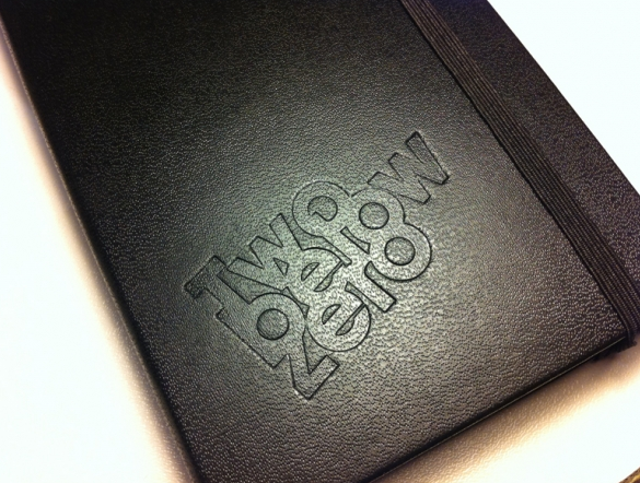
EMBOSSED LOGO


DEBOSSED

PACKAGING & PROMOTION

DIE CUT

DIE CUT

DIE CUT


LAMINATED

SPOT COLOUR PACKAGING

SPOT INK COLOUR WITH VARNISH

SPOT FLOURECENT INK, COATED

METALIC SPOT INK

SPOT INK, UNCOATED

SPOT COLOUR, DYE INK

SPOT INK

SPOT VARNISH


PUBLISHING & EDITORIAL

SPOT UV VARNISH


COATED
These brochures are for the promotion of Birmingham's 'Big City Plan'


SPOT VARNISH

COVER PRODUCED WITH BLACK FOIL BLOCK AND DOUBLE SPOT VARNISH

LAMINATED BOOK COVER


UNCOATED PRINT

INFORMATION & WAYFINDING


UNCOATED

FOIL INK

VARNISH COATED


Thursday, 6 October 2011

LOGO - other designs/research

From a book that I took out from the library called;

LETTERHEAD & LOGO DESIGN - ROCKPORT - MINE


I found some interesting layouts/formats for my logo


This Great Britain snow sport logo has a very simplistic format but a similar one to the 'soundwave ball' in my logo


Wednesday, 5 October 2011

LOGO - layout

Keeping the origional shape/symbol which I created for the first logo, I need to look at how to involve and place the text with it in order to have a good overall composition of the logo, and not necessarily rely on having the logo placed within another shape; circle, box etc

This logo is a good example for me to look at because of the circular format of the image. The letterform of this logo is quite long, similar to me using two words. I origionally thought that I would place the two words on different lines, but now looking at this logo I may not need to.

This logo does not have a similar layout to my logo because of the shape of the image. In this logo the image/symbol is worked into the text, rather than it being on top or below the type, I could maybe use this. The only issue with doing this is that in the feed back that I god, it was said that the icon/image that I was using was the strongest part of the logo, in which case, making the typography the main part of the logo could be a mistake?

One of the most famous logos of all time. My image is circular, so I could just have the image/symbol create the shape of the logo and place the text infront of it?
or
 or 
I could have the name kept in the centre of the symbol, but instead have it more pronounced and outlined like this car logo. 


I could still keep the focus on the image/symbol of the wave in the centre of the logo and just have a rim of text for the brand name on the outside. 

Have the type at the bottom of the circular part but not underneith it. I think this could also distract from the image and make it too cluttered and about the letterforms than the image. I don't necessarily want one of them to be stronger than the other, but I do want there to be a balance. If anything I would prefer there to be a stronger basis on the image than the name, as this is what appears to catch peoples eye more.